asymmetrical vibes by adding a lean-to
- Brooke Frontiera
- Oct 22, 2024
- 3 min read
Updated: Jan 6
if there's one thing I love in design, it's asymmetry. I love the way it draws my attention with the unexpected then continues to keeps my eyes wondering and looking for the next landing spot. when done right it's a pleasant little adventure for my brain. similiar to a scavenger hunt, where I can solve tiny little puzzles that collectively allow me to see the whole picture in a very unique and interesting way. and our barn is dripping in asymmetrical vibes.
flowy as possible
at the start of our barn chats we talked about a patio hang out area and initially I thought we'd do a corner bump out/wrap around kinda deal. after looking at this design detail in more depth I kept coming back to this layout feeling too clunky for what I wanted. we were going to have the biggest play area we could afford so I wanted to keep the lines as flowy as possible. big + choppy makes me feel frazzled.
liking a lean-to
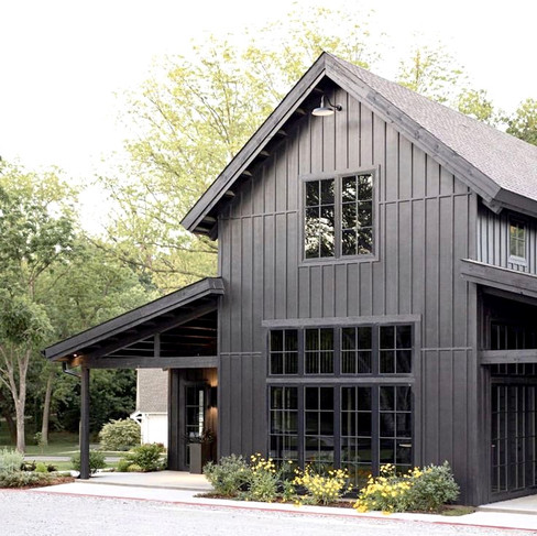
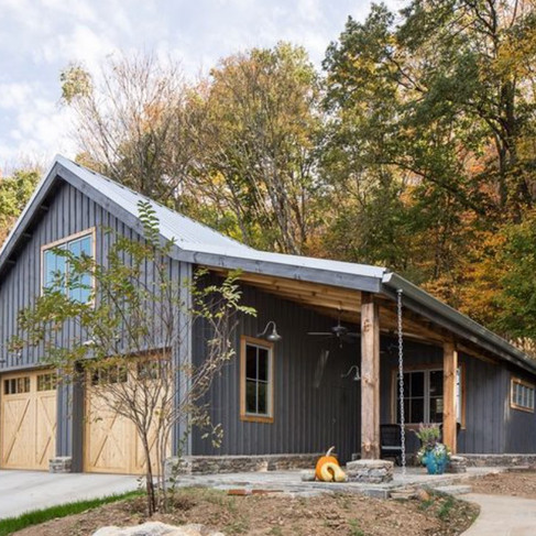
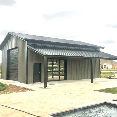
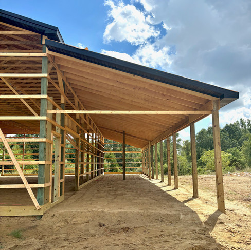
when I was dreaming up our barn I realized I kept coming back to the inspo pics with a lean-to. I liked a few different things about it...
1. it allowed for the patio area without feeling clunky or taking over as the focal point
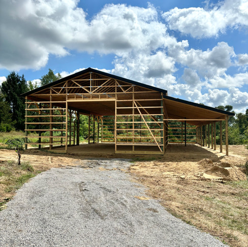
2. it blended a traditional gable roof line with a modern mono-slope and the blend of both gets me so giddy
3. it creates an interesting and beautiful design deatil that never gets old to admire aka, asymmetry
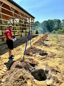
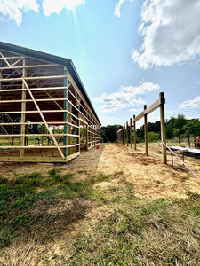
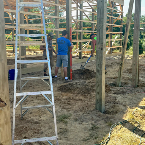
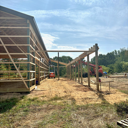
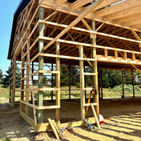
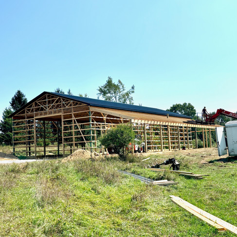
the lean-to seemed to fit so well into our day dream designs because we wanted a clean, temperature controlled kitchen hang as well as a patio. when I saw the few pics of this being done I was sold. turns out our builder had recently added a lean-to patio and enclosed space to an older barn close by. we drove over, took a little tour and it was decided...we are getting one.
scavenger hunt clue
besides the lean-to being it's own awesome detail I love how it will frame the doors on this space and enhance the overall experience. the lean-to will be a scavenger hunt clue to draw the eyes towards the garage door on the side and enjoy the free flowing connection of the patio and barn. from the peak of the mono-sloped roof line the eyes will be drawn down and over to the gridded sliding door, enticing the viewer to come into the kitchen area. ugh...this is going to be so great. I can't wait.
looks are very important and yet the 'visual appeal' is only one part.
if we allow ourselves to truly experience the present moment we can notice how aesthetics actually make us feel something.
more than visual appeal
the way things look impact our mood, thoughts and behaviors. when something is visually interesting it stimulates our brain, stirs up our curiosity, gets us a little more lively, excited and focused. if we allow ourselves to follow that excitement and curiosity we might be propelled to move towards something. when we are moving and living with intention we are engaging not only with our environment but also experiencing a deeper connection to ourselves along with the people and things we choose to have in our surroundings.



















Comentários